11.12.2015

Slowly Rising


This music video for "Slowly Rising" by BEATSOFREEN is animated by the Tokyo - native Kanahebi.  This is as close to perfect as you can get when pairing musical and visual language together; take a minute and get lost in this fantastic work!


More animations by Kanahebi via vimeo here.

More audio by BEATSOFREEN on their soundcloud.

11.05.2015

Daisuke Tajima

A recent art school graduate, Japanese artist Daisuke Tajima has gained attention for his thesis exhibition of large-scale drawings.  Included in that project were dizzying fictitious cityscapes and fantastic imagined battleships, rendered with a very impressive technical precision.  Besides drawing Tajima excels in painting, manga, and sculpture - all of which show a passion for meticulous detailing.

This passionate expression has a very personal meaning for him - in his words, "I wanted to hide away in my own world to ease the loneliness and insecurity I felt from not belonging.  This piece is a world I can believe in."


His website: Daisuke Tajima

8.16.2015

Christian Zander

AKA the Emperor of Antarctica, creates infinitely detailed graphic images that blur the lines between reality and digital fiction.  Truly original, these designs and experiments are nothing like the barrage of recycled themes in modern graphic design that have become the norm.  

As expressed on his website, his work is "perhaps best described as neutral yet intricate meditations on form and human perception.  The large-scale laser prints inspired by mathematics, symmetrical, Islamic construction patters, and his developing interest in introspectivity, subvert the traditional distinction between form and content by seeking a purity of form that is inherently suspicious of narrative intent.  In this way, the Emperor in Antarctica can be seen as an exponent of a complex dynamic that forces the viewer to contemplate the significance of form without narrative, matter without story."


Delve into the vast cellar of work this native Copenhagen artist has at his blog (which I highly recommend), or see his recent work at his website: Emperor of Antarctica

8.13.2015

Zak Smith

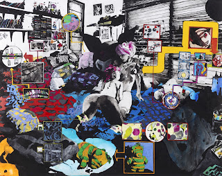
Some new paintings by Zak Smith have been surfacing recently - following his recurrent theme of nude girls in highly detailed environments, usually consisting of their bedrooms.  The level of attention that Smith puts into the description of the scene surrounding the subject is extraordinary, complimenting and coloring the figures that are the focus.  


His website: Zak Smith

2.14.2014

Give Kids Paint

This is probably the best/most epic example of modern graffiti expression I have seen - check out what happens when you put Sofles, Fintan Magee, Treas, and Quench in an enormous warehouse with limitless paint.  Add excellent cinematography and soundtrack and you have reached steez factor 10.


7.03.2013

As For the Updating...


I’ve updated my blog links (on the right), so that if you need to find some art and/or want to waste some time looking at pretty things you can use my blog as a gateway to some creatively curated blogs and websites to that tune.  I don’t update this blog  much these days, really only when something is exceptionally inspiring to me personally at the time that I see it.  For the foreseeable future my favorite art finds will be posted on One Grand Gallery’s facebook page, which you can follow for those updates and for the physical shows and various happenings that occur there.  

I’ll tell you why I do this, too.  

If you’re like me, then you find inspiration in details of people’s art that you didn’t know you were looking for.  Then you steal the idea and reconstruct it with your own hands, a recreation that becomes completely different because it’s impossible to copy; and you don’t believe that a perfect copy is worth working for anyway.  The piece that you chose becomes an unwilling subject to all the other pieces that you fit together, recontextualized in a new environment on your piece of paper or your canvas.  

The freedom to choose your boundaries and constrictions is paradoxical, but necessary to create order and beauty.  If all of your ideas were let into your creation it would lose all meaning, it would be confusing, it would be a mess.  As would your life if you believed everyone’s beliefs.  Which is why you approach the knowledge, advice, and philosophy of others in the same way, choosing with a cautious eye which pieces work for you and strike you as true and beautiful.  And all of the ideas you’ve accepted influence your actions, arising somewhere between consciousness and habit like the order and disorder of a new painting.

2.21.2013

Lilfuchs & Flying Lotus

I hope you've already seen this face-meltingly awesome short animation by Lilfuchs for the Flying Lotus song "Zodiac Shit".  Always stoked when great art meets in two mediums so well.  And if this is your first time, put it on full screen and plug in the speakers!


Lilfuchs website: www.lilfuchs.com

9.03.2012

Etam Crew

Working out of Lodz, Poland, is art duo Mateusz Gapski (aka 'Bezt'), and Przemek Blejzyk (aka 'Sainer').  Together they work as Etam Crew making large scale paintings all over Poland and around the world.  Both work with spray, oil, and acrylic paint, as well as some sculpture and screen printing.  Their work is surreal, placing imagery of animals, people, and graffiti style lettering in environments of surprising perspective and bold colors.
The first image below is by Sainer, called "Primavera"; the second is by both, called "Praying Sinner".
Check out their video of the creation of "Balloon" as well!


Etam Crew's website: www.etamcru.com
Sainer's blog: pblejzyk.blogspot.com

4.17.2012

Jean Giraud a.k.a. Moebius, a.k.a. Gir

The late Jean Giraud was an impressive force in the comic world, known under the pseudonym Gir for his comic series "Blueberry", and used the name Moebius for his well-known "Métal Hurlant" (Heavy Metal, in english).  His unique abstract and surreal style, described by some as a kind of medieval futurism, has had a huge influence in sci-fi art and film globally.  Films that he has contributed to or has been credited with influencing include Alien, Willow, Tron (1982), The Fifth Element, Star Wars V, Blade Runner, and Space Jam. What a baller.


For more of his work, try the Airtight Garage.

1.24.2012

El Mac Vid

Here's El Mac, talking about his art, process, and his project in Ho Chi Minh City, Vietnam.  Art crush increased.
More awesomeness on his website @ elmac.net

12.13.2011

Chris Berens

Chris Berens was born in 1976 in the Netherlands, where he was a freelance designer before moving to his studio in Amsterdam in 2004. His paintings have an intense depth and soft focus, which at first glance appear to be digitally-rendered photographs of some kind. But the curious and fantastical images of animals and landscapes, both real and imagined, are created almost entirely with ink. His technical process is truly unique, which he briefly addresses on his website. For an inside peek at his studio and process, check out the video interview below. "How to Catch a Tidal Wave" is the title of this piece. 


His website:  www.chrisberens.com

7.10.2011

Ian Francis

The paintings coming from british artist Ian Francis immediately caught my eye.  Figures are set in environments of striking duality; backgrounds that are both architectural in form and atmospheric, suggestions of movement and stasis, solid and liquid, opaqueness and translucence.  The shapes, lines, and color transitions are both abrupt and soft throughout these scenes.  I love his fully abstracted pieces, as well as ones that bring a sharp focus to the human figure; figures that seem at once to be lost and completely at home in these created complex environments.
Below is one of his pieces and a detail of the figure in it.

His website:  www.ifrancis.co.uk

3.13.2011

Iain Macarthur

Wah wah wee wah!  I am pretty blown away by the work coming from Iain Macarthur.  Born in 1986 he already has a large amount of awesome art, from his sketch work that will transport you to the shady depths of hatching-heaven to his intricate and cleanly detailed design work.  Subject matter includes but is not exclusive to people and their faces, animals, and architecture; their features exaggerated with high energy and meticulous delineation.

His website:  iainmacarthur.carbonmade.com

1.23.2011

Callie Curry, a.k.a. Swoon

I first saw her wheat pastes in NY, but since then Callie Curry has directed her art to completely different contexts using completely different materials.  And yet it isn't hard to see a continuing theme about the potentials of people's individual interactions.  I love that I got to be a part of her interactions, just by seeing her work around Brooklyn, and then finding that the artist behind the art is moving in such positive directions.
Here she talks about her craft and ideas.  Enjoy!

1.03.2011

Nicholas Di Genova


This man lives and works in Toronto, making intensely detailed and awesome art. Focusing on animals that look like Frankenstein-esque experiments in fauna-combination, the images are set in strict and organized chart-like design. The powerful and child-like energy and imagination that exists in such a disciplined setting is what attracts me most, along with great awe for the equally disciplined line work and amount of time his drawings must take. Fantastic!

In his words, "When I was a kid growing up I was obsessed with animals and monsters... I'd draw them everyday, and when I grew up I either wanted to be a zoologist or a monster hunter... When I got a bit older I realized that being a zoologist was less exciting than I had imagined, and that 'monster hunter' isn't even a real job, so I just kept drawing. I pretty much do the exact same thing at 29 years old that I did when I was 9 years old."

His website:  mediumphobic.com

11.28.2010

Geraldine Georges

Check out the mixed media collages of Belgian illustrator Geraldine Georges! Starting with photography and incorporating illustration techniques the result is surreal images involving the female figure, nature, and total awesomeness. Once working in advertising and now as a freelance artist, she is another master of deace imagery.

10.31.2010

Amose


Working from his home country of France, Amose is (currently) a 31 year old illustrator and baller of art. I was immediately enamored with his use of line; flowing movement of the individual strokes build the foundations for his expressive forms and characters of distorted proportion and surprising perspectives. Not only a master of ink, Amose shows deft prowess of spray, acrylic, printing in various methods as well as sculptural pieces. Lucky collaborators of his include Spyre, Sphere, Erone, and Nada who form Murcurocrom Collective. Check them all out!

Amose' website:  amose.free.fr
Murcurocrom Collective:  mercurocrom.free.fr

4.10.2010

Meredith Dittmar


Currently residing in Portland Oregon, creating with clay, is Meredith Dittmar. I am loving how she uses this medium to combine organic shapes and figures with very technical and mathematically-based designs; her attention to detail is immaculate. I get native South American vibes from many of her patterns and depictions, but expanded-upon and re-articulated into her vision. What an awesome blend of natural and man-made patterns! The piece above is titled "A Momentary Summit."

Check out more of her steez on her website:  www.corporatepig.com

4.09.2010

Ekundayo


I am loving the work of Hawaii-born Ekundayo, in all of its subversive vibrancy. Mostly centered around bizarre creatures and the landscapes that are inhabited by them, his color palette of intensely contrasted warm and cool combine with a playful movement to create an almost psychedelic experience. They distort, twist and melt across his uniquely-shaped canvases, born out of acrylic, gouache, watercolor, ink and carving. His blog is tight, and his website is tighter. I mean, like really freakin' tight.

his website:  www.ekundayo.com

2.02.2010

Nimit Malavia


Yo, CHECK out the work and expression of Nimit Malavia right now! He is seriously on par with any illustration work that's inspired me previously. At roughly 21 years of age ('cus I'm not a private investigator), he was born and raised in Ottowa, Canada, and is either attending or has finished up school at Sheridan College for a BAA in illustration (Like I said, I'm no Tom Selleck). I love that as inspirations he includes the work of Hiyao Miyazaki, Haruki Murakami, Carl Jung, and The Dark Knight. As to Jung and the Philosophical side of his work, he is interested in the ideas of the 'shadow self' (which theme possibly crosses over with the batman picture), and the collective unconscious. You only have to breeze through images of his work on his site to know that they are very personal, conjuring up what I assume are personal narratives, but breezing through isn't enough. It is worth your time to consider the execution and meaning of the details in every medium and gesture he uses.

Check out not only his website, www.nimitmalavia.com
but also his blog (with TONS of deaceness), nimit-malavia.blogspot.com
Plus a great interview at Erratic Phenomena.

11.24.2009

BLU

If you haven't heard of Blu, hear here. He draws and paints with mad steez, creating some really wild, fun, imaginitive pieces. You HAVE to check out his animated paintings, which combine his drawing and painting skills with the surrounding environment in an installation/graffiti kind of hybrid. Especially mind-blowingly deace is his collaboration with David Ellis... taking over the surrounding architecture, the piece (called COMBO) gives you a look at the process of their animated painting, constantly creating and destroying itself, moving and evolving with the building and environment. So much time goes into each part of the piece, you can pause it at almost any point and fall over in a jealousy-coma.


Check out his website, which has a link to his blog as well:  blublu.org

6.05.2009

Damon Soule

For an über-deace experience, check out the art of Damon Soule!  His imaginative, detailed pieces blow me away.  There's an immediate psychedelic vibe in the geometric forms and patterns that show up in a lot of his recent work, not to mention the veraciously vibrant colors.  His precise execution of form and pattern echo M.C. Escher, while the juxtaposed movement and surrealistic objects might as well curl their mustaches and call themselves Dalí.  Every detail seems composed to the details in the minutest, like the Fibonacci sequence or molecular structures showing up, as if Damon was intentionally trying to initiate thought or even make viewers question nature..!  He also has an illustrious beard.

His website:  www.damonsoule.com
His Blog:  soule23.tumblr.com

3.29.2009

Andrew Hem


Check out this über-deace illustrator Andrew Hem!  In paintings, drawings, and sculpture Hem creates impressively expressive pieces featuring a myriad of interesting characters.  His paintings have an immediately textural feeling, synthesizing weaving and collage elements at times and abstracting them for a vivid and evocative experience.  Lettering elements also pop up in his paintings, drawings and sculptures, which are graphic and seem graffiti-like in style.  Existing in worlds of sweet color schemes, his choice of elements really come together into very unique and evocative artistic manifestations.

Andrew Hem's site:  www.andrewhem.com

3.05.2009

Nicola López, revisited!


Happiness abounded when I heard that the visiting artist lecturer at the local university (which I attend), was none other than Nicola López!  An excellent lecture on her process and ideas, and a look at the evolution of her prints and drawings (and installations).  Also an excellent photo opportunity!

Once again, find her work at

2.18.2009

Mac


I know I'm posting another graffiti artist (new art-crush?), but this kind of skill transcends labels. I was so stoked on The Mac when I found his art... super deace figurative spray and acrylic paintings, with a unique painting technique to make awesome shading and contour simultaneously. Stunning colors. His drawings rock socks as well, not to mention his delving into stained glass - a unique departure for most graff artists.

His website:  www.elmac.net

... also I love this video of El Mac and Retna

Siloette


Another graff artist - and yet not just another.  Siloette; baller of spray, acrylic and ink - especially when it comes to the female form.  Her color palette makes eyeballs explode and imaginations break through walls of concrete.  Deace!

Her website:  www.siloette.com

Keep Drafting


If you're into design and graffiti art, you gotta check out Augustine Kofie.  He's got a site that he updates regularly with his large and varied body of work.  His human forms are graphic and super deace; his drawing and painting skillz, flowing creativity composed with architectural precision, are what tickles me silly.
Check it out at his website:  keepdrafting.com

10.17.2008

James Jean


This guy's art is damn inspiring. Imaginative, evocative; it just makes me want to draw. Check his immense and amazing drawing skillz! I don't even want to write about it anymore.

His website:  jamesjean.com

6.18.2008

Nicola López


This blog started as a way to keep track of great art that I found in New York.  That trip has passed, but the blog must go on.
Let's continue the journey with an artist I recently found, Nicola López.
Her art departs from a central theme of architectural elements in creative ways, stretching depth and angles, vanishing points and orientation.  The loose style that she uses is an interesting juxtaposition to the rigid architectural pieces found in a lot of these works.  Nature vs. human construction... hmmm.
Enough of my talk; feast your eyes.

Her website:  nicolalopez.com


4.05.2008

Postscript


The amount of inspiring art that we were exposed to was amazing.  The connections and friendships that developed strengthened the whole experience, and I'm really psyched about the contemporary art scene, especially in New York.  It's enough to make me want to move there!  It was also great to see the amount of support the museums, galleries and exhibitions were getting, and excellent that they were giving back to the community (like the Metropolitan Museum taking suggested donations, and the Chelsea galleries opening to the public).  I just wish there were more trees there.
The art scene extended to every level, and I loved all the art we saw on the way to the galleries also.

The Armory


The International fair of New Art at the Armory was exceptional.  Art galleries were representing from many countries, especially Germany for some reason.  The level of craftsmanship was top-notch, I suppose because the galleries are there to sell the art.  I only wish we could have stayed a while longer, and that I was a millionaire so that I could bring some of that home.  I guess i'll know where to go when I am though, right?  One piece that struck me was titled 'Flat Green Piss Painting' by Gavin turk (right).  After inquiring, I found out that the artist did indeed "arrange" his urine on a canvas that was painted with a metallic paint, then allowed to oxidize resulting in a flowing green painting.  I'm always interested in unusual techniques for creating design, and Turk definitely fit that bill.  This kind of venue had a really wide range of art, even if most were made to be sold.  That kind of parameter could inhibit the experimental process where some of the best results are realized, yet I felt that it wasn't very restricted.  It did not have the conceptual sculptures that reflect viewers like I had fallen in love with at Dia:Beacon, and the ideas executed weren't as far-reaching and experimental as the galleries around Chelsea District, but when it comes to the business of acquiring and selling art, this was as good as it gets.

P.S.1


We visited P.S.1 to see 'Whack!: Art and the Feminist Revolution.'  Included was art from many countries, from 1965 -'80.  Before going to this exhibit I would never have thought to fall in love with feminist art, but after seeing such a wide variety of expression from that movement I did indeed think about it, before disregarding the notion.  It's always fun to see expression of such force, with angst and frustration and anger spilling out of the art and into the viewer.  The feminist revolution was well represented, I think, by the art we saw there.  Materials ranging from oil paint to collage and mattresses, with messages ranging from subtle to extreme and in-your-face made it evident that a great variety of women were at this point united to the cause.  It's refreshingly stimulating to think that art can play a significant role in social change, and this exhibit could really help inspire future methods for change.  I didn't find the feminist concept very relevant for the current social climate, but it is an example of how free expression can prevail.  My favorite piece there wasn't about feminism as far as I could tell.

4.04.2008

Tom Burr


The Sculpture Center is an interesting building, renovated from an old trolley repair station.  It was here that they featured many of Tom Burr's newest sculptures.  His basic forms are the building blocks that transform into characteristic objects that for me take on a narrative quality.  For example, he used many long wooden slabs that were pieced together in a way that on a basic level suggested the human form, then added to it by placing personal items around and on them.  Sometimes they would face each other, suggesting an interaction and inviting a closer inspection of the items or surface treatment involved in giving these forms human qualities.  One was placed in a smaller white room by itself, and had a straight jacket draped over it under bright lamp light.  The atmosphere created by this placement of objects and personified forms was effective, and for me evoked a sense of unfinished narrative.  It was as if you were stepping into a scene that was permanently on pause, in limbo. 

Whitney Biennial


The Whitney Biennial featured a huge quantity of art this year, by many up-and-coming artists.  I found it very interesting, in that the majority of pieces I encountered were uninspiring and lacked a clear concept and/or the craftsmanship to convince me that they were actually complete.  That's not to say that there weren't effective pieces, but they were few and far between.  One piece I liked featured multiple glass rectangular shapes that were shipped via FedEx, as was evident by many which were still in their packaging.  The process of getting them to the Whitney was evidently a bumpy one, as they were cracked and split all over, allowing the viewer to imagine the various impacts on their trip.  The most interesting part for me was the project next door, away from the main gallery.  Set up there was a Neighborhood Public Radio station, featuring artists who endeavored to broadcast truly free radio.  Their idea stemmed from the changes that National Public Radio has undergone, which are now far from the ideals of the public, according to them.  Their mission was to broadcast anything and everything from the surrounding neighborhood, inviting people from off the street and setting up microphones at a station in the Whitney's bottom floor.  We had an opportunity to get on the air; each of us expressing our thoughts on the Whitney's Biennial in only a few choice words each.  This is a program that I hope to see more of.

MoMa


"Color Chart: Reinventing Color."  That was the name of the exhibit at the Museum of Modern Art which gave a retrospective look at the transformation to standardized manufactured colors.  Before that colors in traditional and non-traditional pieces were very much up to the individual to express their specific idea.  This exhibit featured many artists' experimental projects with color, some leaving their color decisions up to chance or arbitrary means.  The atmosphere was extremely stimulating but quickly waning, with florescent lights and vivid juxtapositions of every color imaginable jammed into every corner of the galleries.  Color still can have a very specific meaning for an individual, whether it's the paints they mix or the shirts they wear.  The art I saw that day made me more appreciative of those personal choices that we make, that are unique to every person's taste.  The idea of mass-producing color limits the individual, which is an interesting subject to take on in a piece of art, however I found myself uninterested by the impersonal quality of those there.  My personal ideals in color are that of personal expression, not in pleasing the majority.  

Subodh Gupta


In the back of a gallery we stumbled upon the works of Subodh Gupta, entitled "Still, Steal, Steel."  Three sculptures stood around the back of this gallery, eery constructions of large proportion heads made up of metal objects (steel, one could guess).  Except for the handcrafted look of the facial features, these heads wore the remains of hundreds of discarded nick-knacks, including pans, ladles, and cups to name a few.  They were military in uniform, the heads wearing a ski-mask, gas-mask, and helmet respectively.  Perhaps this was a comment on the rigidity of process and structure that current military practices have, or of the cold composure the ideal soldier has in battle.  Maybe the use of hundreds of very small objects to construct a large objects is an allegory to modern militaries.  The faces are american and unexpressive, combining with the material and unsaturated colors for a hard, cold feeling as one walks around them.  Gupta executed the facial features extremely well, and overall I was very impressed by his craftsmanship here.

Sol DeWitt


At first when I saw this piece (entitled "Scribble"), I was impressed by the fine detail in the forms depicted, in what I thought was a painting.  I was informed that it was all hand drawn by assistants of Sol DeWitt, in graphite.  Not only that, during the 4-week process of scribbling, DeWitt passed on, making this his last piece.  The formal elements are direct - gradations in value make up the illusion of form, that of round objects, abstractly composed one on top of another.  The extreme detail is reminiscent of Jackson Pollock, creating a huge variability of detail that unifies the whole piece.  Experiencing the piece walking by and with your nose an inch away from the surface are two very different experiences with this piece.

Joel Coen


Escaping the gallery scene, containers were set up by DIVA street-side, featuring digital art pieces by various artists. One that was particularly interesting to me was a container with two pieces by Joel Coen. Upon entering, one encountered a sculpture of a cross made up of dozens of small digital television screens that were all showing different television programs. The cross is an immediate connection to religion, and speaks about our culture's addiction to The Tube. The devotion to television and movies in the United States is extreme, and that piece was a straightforward message about that. Further inside, three projectors were set up, displaying a bizarre film. Each projector showed a different angle of the action, which centered around a shaved and naked man. This oafish fellow stumbled through what looked like a cave, where dozens of other shaved people lay bloated and immobilized on stretchers, shelves, or on the ground. Another section of this piece depicted the man sleeping or otherwise unconscious in a large crib, which slowly filled up with a strange murky water until he was floating, in the fetal position, in the dark liquid.
I believe these pieces were tied together in concept, that of American over-indulgence in entertainment and the service industry (which is now the highest-profiting industry in the country). The dark images of the stumbling or unconscious man possibly represented our plight as we allow the will of others to govern our lives for the sake of ease, forever numbing the otherwise creative and unique minds with the capacity to flourish that each individual possesses.

Brian Jungen


Brian Jungen is an artist we saw, who took consumer items and recontextualized them for his show.  This included recognizable football jerseys, which he cut into strips and rewove them into blanket-like forms that were reminiscent of native american patterning.  Also on display was his Jerrycan, a used gas canister that he drilled intricate hole patterns into.  The act of taking this item, which litter streets and are generally used in a very crude manner, and turning it into a piece that is displayed on a pedestal in a gallery stretches the mainstream ideas of what makes art.  This use of putting this mass-produced object speaks about the effects of globalization on the environment, and culture; for me criticizing how the individual is overlooked to produce efficient and disposable objects for a large population.  Making an object like this your own through artistic re-interpretation gives an object different meaning, and the relationship he's created with the jerrycan speaks to his own life living on a reserve and frequently reusing discarded mass-produced items for new purposes.

Marcel Zhama


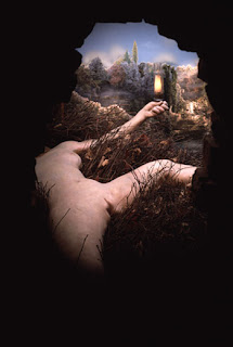
Marcel Zhama was featured in a gallery that we checked out in the Chelsea District.  One of his most interesting works was a sculptural piece referencing Marcel Duchamp's "Étant Donnés."  In the original, a large wooden door hid a nature scene with a naked figure, viewed through one of two peepholes in the door ( right).  It was thought that this piece (which was his last) was Duchamp's response to the deconstruction of images, and was considered less of a sculpture and more so a painting.  In this 'painting without a picture plane,' the objects are placed not on a two-dimensional plane as would be traditional, but placed in a three-dimensional context.  This context can only be viewed through a peephole, making the viewer's perspective the only definite condition of the piece.  Marcel Zhama recreated a similar context for his piece, with a large wooden door, a peephole, and behind it a scene of two naked figures lying on a hill, with a natural landscape that extends past a fox who gazes on.  The idea with the fox is that he was responsible for knocking out the two people.  The strongest part of this piece for me was the non-traditional role that the viewer plays.  One is made to feel like they are almost spying in on this scene, reminded of the subjectivity of their own perspective.  Also the unexpected nature of being confronted by a person's genitals in the piece can make the viewer uneasy (possibly).  This is a challenge to the ideas of what art, or more specifically a painting is.

Dia:Beacon


What a unique gallery Beacon is.  The large, expansive layout allowed for conceptual art of massive proportion, like Richard Serra's metal walls.  Rising maybe 20 feet, these slabs of dark metal curve into circular and spiral forms, leaving just enough room for viewers to walk into the dynamic space that he has created.  The walls fluctuate between leaning in over one's head and expanding into wide openings, making it impossible to walk through in any passive way.  In the center one finds another area, empty and devoid of anything but the space and the viewer.  These pieces force the spectator to readjust their normal routine of walking through rectangular spaces, like hallways or alleys, and consider their own size, shape, and movement as they relate to these cold dynamic sculptures.  
The concept of exposing the viewer to themselves through sculpture, is repeated in many of these highly conceptual pieces at the Dia:Beacon.  Although i've personally seen pictures of many of these types of works, they really only came alive for me in the physical experience of confronting them, and interacting in person.  Go to this gallery.

3.24.2008

Cai Guo-Qiang


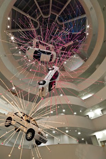
It was hard to miss Cai Guo-Qiang's installation a the Guggenheim, probably because he suspended eight cars in the middle of the place.  His installations were presented under the title "I Want To Believe."  At first I was amazed by the sheer spectacle of suspended cars, 'exploding' with electronic light bars extending out from the center of each car, in vibrant colors.  Despite the normal tendency to find multiple cars above you as slightly dangerous, this piece portrayed them in a fantastic and surreal way.
It seems like a comment on american values, referencing the constant barrage of violence and other vivid imagery in the media and culture.  The high level of stylization is and has been a part of our art and media culture as well.  That, and the suspended cars are made by Chevy.

Also the clay figures that he constructed, which fell apart as they dried in the gallery, were really cool.

3.23.2008

Famous Artist Run-In

Do YOU know who this is?

Jasper Johns

In the Met today I checked out one of their exhibits, that of Jasper Johns' work during his 'grey' period.  Yes, these paintings were close to, if not exclusively completely neutrally unsaturated grey.   "Two Flags," made in 1959, was one that included his theme of the American Flag.  This piece had two flags, one on top of the other, that from a distance looked exactly the same.  Close up though, one finds that the different levels of grey shaded areas are made up of both tight and loose brushstrokes, that differ a great deal from each other.  Some of the figures of the stars are close to representative of the American flag stars, others only reference the shape abstractly. One was an X shape.  The texture is both rough and smooth, some parts flat and others raised up by thick layers of paint.  In some parts the canvas shows through, especially around some of the borders.  All of these dynamic elements create a very lively piece, but a surprisingly static one from a distance.  Whoa!

3.22.2008

Lofstel


OK now we're at the loft/hostel, which looks like an Ikea and has some other travelers staying.  Just got back from an Über von trendy thai restaurant named Sea.  Super great food!